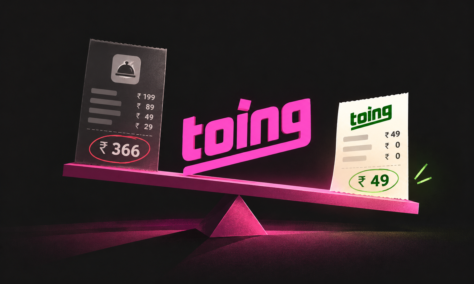
Most apps quietly hope you never open a competitor’s app to compare prices. Toing does the opposite. It shows you what the other app would charge, right next to its own price. One line, two numbers. That small design choice is doing more selling than most ad campaigns ever do.
Summary
The Toing price comparison puts a typical food app price next to Toing’s own price, so budget buyers see the gap without switching apps. Toing is backed by Swiggy and built for students and Gen Z, with dishes starting at ₹49 and no packaging or platform fees stacked on top. The higher rival price acts as an anchor. It only works while Toing stays genuinely cheaper.
Internet Culture · Decode 007 · Teardown by the desk
Toing at a glance
| Backed by | Swiggy |
| Built for | Students, Gen Z and budget-conscious buyers |
| Entry price | Dishes starting at ₹49 |
| The pricing promise | Prices close to restaurant menu rates, without hidden packaging or platform fees |
| The hook | Shows what another app would charge, right beside Toing‘s price |
The verdict card
| Dimension | Score | Why |
|---|---|---|
| Strategic coherence | 9/10 | A value brand proving its price on the exact screen where people decide. |
| Craft | 8/10 | Two numbers side by side. Nothing to read, nothing to calculate. |
| Risk | 5/10 | One unfair comparison and the whole promise becomes a screenshot against you. |
| Replicability for you | 7/10 | Easy to copy if you really are cheaper. Dangerous if you aren’t. |
Verdicts are opinionated by design. Disagree loudly.
Why this is worth ten minutes
- The Toing price comparison looks like a feature. It is the entire marketing plan, built into the checkout.
- A Swiggy-backed app showing that mainstream app prices are higher sounds like self-sabotage. It’s actually a textbook fighter brand move.
- The same idea works for any brand whose promise is “cheaper”, and fails badly for brands whose promise is anything else.
1 The scene
You want dinner under ₹150. The first app has the dish you want. The second app might have it cheaper. So you open both, search again, check whether the restaurant is the same, and try to work out which total is real.
By the time you have compared the prices, the choice is no longer just between two meals. It is between the effort of checking and the ease of ordering whatever is already in front of you.
Toing puts a rival price beside its own. You do not have to leave the app to compare. The screen has brought the argument to you.
That small change does two jobs. It tells you Toing wants to compete on price, and it tries to make the comparison before another app gets the chance.
The feature looks simple. The hard part is making sure the two numbers deserve to be compared.
2 What is the Toing price comparison, and why does it work?
The Toing price comparison is a simple display. Next to Toing’s price, the app shows a reference price from a mainstream food delivery app. The message is plain: same kind of meal, smaller bill.
It works for three reasons.
It does the homework. Price-sensitive customers compare, and comparing takes time and effort. When the app does it for them, it saves them work. People reward brands that save them work.
It borrows a higher number. The rival’s price is the first number the eye lands on. Toing’s price is then judged against it. That’s price anchoring, one of the most reliable effects in pricing psychology. A ₹129 meal feels cheap next to a much higher total. On its own, ₹129 is just a number.
It ends the decision on the spot. When customers leave your app to compare, some of them never come back. Showing the comparison inside the app means the decision happens right next to the order button.
3 Why would a Swiggy-backed app show rival prices?
This is the most interesting part of the story.
Swiggy runs one of India’s biggest food delivery apps. Like most mainstream apps, it charges delivery fees, platform fees and packaging fees. Then Swiggy backs a separate app whose whole pitch is that those fees are too much.
That sounds strange until you see the strategy. Marketers call it a fighter brand: a separate, cheaper brand a company launches to win price-sensitive customers without cutting prices on its main brand.
Picture the alternative. Suppose Swiggy slashed fees across its main app to win students. It would lose money on millions of orders from people who were happy to pay. A separate app lets it go after the budget buyer without touching the main business.
The separate name matters too. Swiggy’s main app is built around choice and convenience. It can’t run an ad saying “our fees are too high”. A new name with its own identity can say that loudly. This is exactly the Trust Transfer Test from our piece on brand architecture. When putting your name on a new product would confuse or contradict your main brand, you give it a different name.
So Toing isn’t asking “is this meal good value?” It’s asking “why pay extra fees for the same bowl?” That’s a much easier question to win, and Swiggy’s main app never has to answer it.
THE BORROWED ANCHOR
The Borrowed Anchor is a pricing move where a brand uses a fair, relevant competitor price to make its own price easier to judge.
It works only if the customer can trust the comparison.
Rule 1. Show, do not just claim. “Lowest prices” is a slogan. Two current, comparable prices give the customer something to inspect.
Rule 2. Compare like with like. The same dish, restaurant, location, time and price conditions. If the comparison excludes fees, say so.
Rule 3. Borrow an anchor you can keep beating. If the price gap disappears, yesterday’s proof can become today’s screenshot against you.
4 The mechanism stack
01. It saves the customer a search. The customer does not need to leave Toing, look up the same dish elsewhere and remember two prices. That saved effort can make ordering feel easier. The value is not only a lower number. It is one less task.
02. It gives “cheaper” a reference point. A price without context is hard to judge. A second number gives it context, as long as the two prices are fair to compare. That is where the Toing price comparison can use anchoring without needing a long explanation.
03. It makes the promise visible at decision time. A general claim on a homepage can be forgotten by the time the customer reaches checkout. A price comparison beside the dish is harder to miss because it appears when the customer is choosing.
04. It helps the right audience recognise the offer. A customer who cares most about price can see that the app is trying to solve a price problem. That may be a good fit for the student and younger, budget-conscious diners described in Toing’s positioning. It will not persuade someone whose main concern is something else.
05. It can build a habit of opening Toing first. If customers repeatedly see a useful, fair comparison, they may start checking Toing before opening another app. That is a possible retention effect, not a guaranteed result. The app would need order and repeat-use data to show whether it is happening.
This is different from the Blinkit free delivery bar. Blinkit asks the customer to add more to reach a threshold. Toing puts a price comparison in front of the customer. Both use the moment of choice, but they are pulling on different behaviour.
There is a related point in our piece on the goal gradient effect: a decision often gets easier when the next step is made visible. Toing’s screen does not use the same mechanic, but it follows the same useful discipline. Do not make the customer work to understand the offer.
5 The counter-weight
A lower item price is not always a lower order total. If the app shows the menu price but not the final payable amount, customers may draw a bigger conclusion than the comparison supports. Clear labels matter.
The comparison can become unfair without looking unfair. Prices may change by location, time, restaurant, membership or discount. A price that was accurate when the screen was built may not be accurate when the customer sees it.
One bad comparison can undo many good ones. Customers are more likely to share a screenshot when a claim looks wrong than when it looks right. If one rival offer makes the comparison misleading, the story can shift from “Toing is cheaper” to “Toing’s comparison cannot be trusted.”
Price can recruit customers who leave as soon as someone is cheaper. A low-price offer may bring people in, but it does not automatically create loyalty. If the entire relationship rests on being the cheapest, another discount can take the customer away just as quickly.
Comparative advertising needs care. A rival price is a factual claim. It should be current, clear and supported. The Advertising Standards Council of India’s advertising code is a sensible place to check the rules before making public comparisons. Confirm the current requirements for the exact format before relying on a general summary.
This is where social proof and price comparison differ. Social proof tells the customer that other people chose you. Toing’s screen asks the customer to inspect the price claim for themselves. Both depend on trust, but one is a signal about other buyers and the other is a claim about the product.
Internet Culture verdict desk
“Lowest prices” is a promise. Two numbers side by side are proof. Customers stopped believing promises a long time ago.
6 Steal this
01. Write your main promise in one line. If it’s “cheaper” or “faster”, ask how you could show it instead of saying it.
02. Show the comparison where the decision happens: on the product page or at checkout, not just in a homepage banner.
03. Compare final amounts with every fee included. Partial comparisons look like tricks.
04. Set an honesty rule: if a comparison can’t be kept accurate, don’t show it.
05. If you’re a big brand under price pressure, consider a fighter brand before you cut prices on your main one. Give it its own name and its own promise.
06. If you’re not the cheapest, compare on something you do win: delivery time, freshness, return policy, warranty.
07. Track complaints and screenshots as closely as conversions. Trust is the real asset here.
7 Frequently asked questions
What is the Toing price comparison feature?
The Toing price comparison feature shows a reference price from a mainstream food delivery app next to Toing’s own price, so customers can see the difference without switching apps. It’s built for students and budget-conscious buyers who normally compare prices before ordering.
Who owns Toing?
Toing is backed by Swiggy. It runs as a separate budget food app with its own name, focused on low prices, dishes starting at ₹49, and no packaging or platform fees added on top.
Why would Swiggy launch a cheaper app instead of cutting its own prices?
A separate budget app works like a fighter brand. It lets Swiggy win price-sensitive customers such as students without lowering fees for everyone on its main app, and without its main brand having to say its own fees are too high.
What is price anchoring?
Price anchoring is when the first price someone sees shapes how they judge every price after it. Showing a higher rival price first makes a lower price feel like a better deal than it would on its own.
Is comparative pricing legal in India?
Comparative advertising is generally allowed in India if it is fair, accurate and not misleading. The Advertising Standards Council of India has rules on comparisons, and trademark law limits unfair use of a competitor’s name. Comparisons should include all fees and be kept up to date.